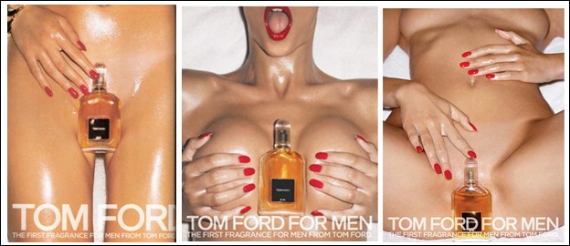
This advertisement was issued by Tom Ford which is initially communicated through the bold, upper case letters “TOM FORD FOR MEN” the white font color placed on beige along with the font style indicates the brands need to get their name across to the potential consumers. This point is further proven through the statement ‘the first fragrance for men’ being the first issued product in a new market Tom Ford would need to establish/ bring focus to their product which is the core purpose for publishing an ad that defies social standards.
The necessity of having an eye-catching brand name on this ad is further understood when added to the image context of a nude woman, as this not a usual sight in modern society’s censored standards the woman is the first and most impactful part of the image. Her features are not visible other than her mouth in image 2 which is not captured in a flattering way rather in a sexual way that gives a visual reference to ‘blow up dolls’ somewhat indicating of the way in which men view the woman, as a ‘sex toy’ instead of an ‘equal human being’.
The angle in which the image is taken zooms into the woman’s body which provides a ‘mysterious’ or an ‘anonymous’ feel as her face is not visible, this increases the curiosity of the male viewers by wanting to know more and wanting to see more. The areas in which the male viewers would ‘want to see more’ are covered with the product – implying that “this product is what you want” or “if you want this buy our product”. Regardless of the product having no relation to a sexualized woman Tom Ford classifies all men as a market into the types that are sexual animals and only attracted to women.
The colors used are monotonous between white and beige and the most eye-catching points are the red on her nails and lips. Each image has a hint of red on it somewhat guiding the viewer’s eye to the product/ what the viewer ‘wants most’ (the hands aim at the product).


 RSS Feed